Lifestyle
How to Create AI Images for Different Content Needs

The same image rarely works equally well as a blog header, a social post, and a campaign banner. Each placement asks the picture to do a different job. An ai image generator becomes more useful when you plan that job before writing the prompt: explain an idea, attract attention, establish a mood, or leave room for an offer. This guide covers common content needs and shows how to move from a written brief to an image that works in its intended setting.
Start with the communication task
Before choosing a visual style, write what the viewer should understand. “We need an attractive image about remote work” is open-ended. “We need a blog illustration showing how interruptions fragment focused work” gives the image a clearer purpose. A desk covered in gadgets may look relevant without explaining the point. A calm workspace interrupted by several competing signals might communicate it more effectively.
Next, identify the audience and where they will see the image. Readers opening a detailed article have more context than someone scanning a feed. A presentation audience may view the picture from a distance. These differences affect how many elements the image can support and how direct the visual relationship needs to be.
Add three practical constraints to the brief: the main subject, the space required for words, and the features that must remain accurate. For a fictional illustration, you can invent a room. For a promotion involving a real product, its shape and advertised features need to match the authorized product material. Choosing the role first helps you decide whether to generate an entire picture or only a supporting background.
Create blog and editorial images that explain one idea
A blog image should relate to the article’s actual argument. A generic glowing brain adds little to an explanation of how people organize research. A more useful illustration might show scattered notes becoming a small set of organized groups. The reader can connect that relationship with the subject before reading a caption.
For an article header, plan the crop as well as the full image. Keep the main relationship visible if the website trims the edges. If a title sits on top, reserve a quiet region rather than leaving typography to compete with detailed artwork. The best arrangement depends on the site’s template, so test a rough version early.
Use a proposed brief such as: “Original editorial illustration of scattered paper notes being arranged into three clear groups on a desk, one visible pair of hands, restrained blue and cream palette, overhead composition, low-detail area at the left for a headline added later, no lettering or logos.” Check whether the grouping is recognizable. If the model fills the frame with decorative stationery, reduce the objects instead of asking for a more professional appearance.
Design social images for recognition at small size
Social images often have less time to establish their subject. Start with one focal point and a clear relationship between it and the message. A crowded illustration may work inside an article but become unreadable as a feed thumbnail. Preview the picture at realistic phone size before investing in fine texture.
For a small business announcing a seasonal collection, a fictional botanical backdrop could create atmosphere around an accurate product photograph. For a creator sharing a practical tip, a simple before-and-after arrangement may be more useful than a decorative scene. In either case, keep the image’s promise connected to the accompanying post.
Separate the artwork from the exact copy when that gives you better control. A date, price, discount condition, or short instruction should be easy to correct. Requesting a scene without lettering, then adding approved words in an editor, also lets you test different messages against the same visual instead of regenerating the whole picture for every wording change.
Build campaign visuals around the real offer
Campaign artwork needs to make room for a recognizable subject, a message, and a next step. Decide which element leads. An awareness graphic may emphasize a mood or idea; a more practical announcement may need the offer to be immediately understandable. Trying to give every element equal prominence usually creates competition rather than clarity.
Use authentic source material for real products and evidence-based claims. A generated scene can provide a setting, but it should not invent a product connection, display a nonexistent accessory, or imply a result that has not been demonstrated. Review the complete composition after adding the actual product, because shadows, scale, and perspective affect whether the combined image feels coherent.
Consider producing several purposeful variants rather than near-identical alternatives. One version can emphasize the product, another the relevant situation, and another the central benefit through an illustrative metaphor. Keep the approved offer constant while comparing them. This makes the choice about communication rather than which background happens to look most impressive.
Explore creative illustrations without losing the brief
Creative work allows more interpretation, but a clear brief still helps. An image for a story, a presentation, or a personal project should establish the intended mood without requiring every detail to become symbolic. Choose a small number of meaningful elements and explain how they relate.
A book cover is one example. A reflective mystery might use a greenhouse with one opaque pane to suggest concealment. That detail can be tested alongside the title, but the same design principle applies elsewhere: select one readable visual idea rather than trying to summarize every part of the project in a single picture.
For a presentation about collaboration, several mismatched objects supporting one structure could convey a different idea from a row of smiling people. Neither is automatically better. Ask whether the audience can connect the picture with the intended point without a long explanation. Creative freedom is useful when it creates a clearer or more memorable relationship.
Turn the brief into a usable generation prompt
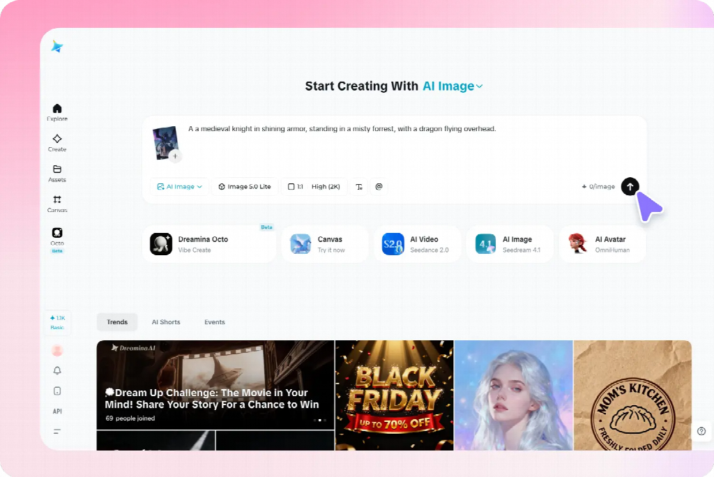
In Dreamina, enter a written description or use a supported reference to communicate the intended subject and visual direction. Choose available settings appropriate to the placement, then inspect the generated candidates in context. Treat references as guidance and review the output; they do not remove the need to check accuracy, composition, or permissions for supplied material.
A practical prompt describes the subject, action or relationship, setting, composition, style, and exclusions. For a campaign background, you might write: “Original warm kitchen illustration, ceramic cup on the right side of a plain table, soft morning light, muted cream and brown palette, broad quiet wall area on the left for an offer added later, no logos, packaging, hands, or lettering.” This is a proposed example, not a claim about a tested output.
The structure matters more than adding many adjectives. “Cinematic, stunning, beautiful, premium” does not explain where the cup belongs or what space the message needs. If a candidate is close, revise the missing relationship: move the subject, simplify the background, or reduce competing contrast. Change one important variable so you can assess what has improved.
Refine the image according to the actual problem
Separate a local defect from a failed concept. An extra object may be removable with a selected-area edit. An unsuitable viewpoint may require a new generation. A headline that covers the focal point may be a layout problem rather than an image-generation problem. Choose the intervention that addresses the cause.
Inspect important boundaries after editing: hands meeting objects, product edges against the background, and reflections or shadows that establish position. A correction can solve the selected area while damaging a neighboring relationship. Compare it with the unedited version at the same scale so a more detailed result is not automatically mistaken for a better one.
For a content series, retain a few stable choices such as palette, viewpoint, and illustration treatment. Vary the subject or relationship to suit each message. Consistency should make the pieces recognizable as a family without forcing different ideas into an identical composition.
Approve the image inside the finished content
Place the candidate in the actual page, slide, or post with the intended copy. Check the smallest likely display, not only a full-screen preview. Confirm that the main subject survives the crop and that any words remain readable over the full image area.
Ask a reviewer what they think the content is about and which visible feature led them there. Their response can reveal a mismatch that preference questions miss. An image may be attractive yet suggest a different product, tone, or topic. Revise the feature responsible instead of simply generating more alternatives.
Keep the approved artwork, prompt, editable layout, and final export together. Reusing the image elsewhere may require a new crop or text placement, not just a smaller file. An AI image is ready when it contributes something specific to the content, remains coherent in context, and lets the audience understand the intended message with less effort.
Use a short comparison brief to choose among candidates
Record the purpose, placement, required word space, and most important visual relationship beside each shortlisted image. Then compare the candidates with the same draft copy. For an editorial header, prioritize whether the idea is recognizable. For a social card, check what remains visible at small size. For a campaign background, inspect the actual product or message in the composition.
This avoids choosing by texture or novelty alone. One candidate may have richer detail while the other leaves a clearer path to the content. If neither supports the task, revise the brief instead of combining every attractive feature into a more complicated request. Save the reason for the final choice so later adaptations preserve what made the image useful.


Who Is Sol Xochitl? The Inspiring Life Story of Exodus Tyson’s Mother

Who Is Sherry Aon? The Untold Story Behind Rick Gonzalez’s Wife

Who Is Krista Visentin? A Closer Look at the Amazing Life of David Visentin’s Wife

How to Prepare Your Travel Declaration Before Visiting Another Country

Who Is Aliza Barber? The Remarkable Life of Lance Barber’s Wife

Who Is Korina Harrison? The Truth Behind Corey Harrison’s Ex-Wife

Who Is Tanja Rosner? The Untold Life Story of Tate McRae’s Mother

Who Is Jaisal Andrews? Inside the Life of Naveen Andrews’ Son

Who Is Saffron Le Bon? The Untold Life Story of Benjamin Compston’s Wife

What Is OpenSkyNews and Who Are Its Two Co-Founders?

Who Is Kerri Browitt Caviezel? The Inspiring Life Story of Jim Caviezel’s Wife

Who Is Otelia Cox? The Remarkable Life Story of Tony Cox’s Wife
-
 Celebrity3 months ago
Who Is Tanja Rosner? The Untold Life Story of Tate McRae’s Mother
-
 Celebrity3 months ago
Who Is Jaisal Andrews? Inside the Life of Naveen Andrews’ Son
-
 Celebrity3 months ago
Who Is Saffron Le Bon? The Untold Life Story of Benjamin Compston’s Wife
-
 Entertainment2 months ago
What Is OpenSkyNews and Who Are Its Two Co-Founders?
-
 Celebrity3 months ago
Who Is Kerri Browitt Caviezel? The Inspiring Life Story of Jim Caviezel’s Wife
-
 Celebrity3 months ago
Who Is Otelia Cox? The Remarkable Life Story of Tony Cox’s Wife
-

 Celebrity3 months ago
Who Is Sue Johnston? The Remarkable Life Story of Joel Palmentor’s Mother
-

 Software2 months ago
Voozon.com Explained: What It Really Is Behind the “Knowledge Platform” Label